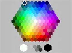
 According to the Knot.com, beautiful color pallets will be splashing all over weddings and events in 2014. We love this trend. One piece of advice I constantly give my brides is to choose a pallet of colors instead of a uniform and prom like look of two or three colors. Pallets of colors consists of four or more main colors in the design. This allows for a more creative and often less expensive choices by freeing restrictions of design materials being offered in limited colors, sizes and amounts. For example, utilizing color combinations containing only red, black, and white the designs options are rather limited moving in the way of valentine's day, roses for sweethearts or something of the like. One would be surprised how with the incorporation of just one more color how the possibilities open up and become virtually endless. In our previous example using red, black and white we can incorporate yellow and would brighten up the pallet and can then be used as springtime theme or the two colors in contrast brightly and boldly on the tables and centerpieces with a black and white damask background. We could also incorporate blue in the pallet and have a more patriotic look for a fourth of July wedding or a military affair. We have chosen our favorite color pallets for 2014. We will describe the colors and offer themes to incorporate designs and looks for your big day! 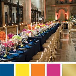 Royal Blue, Lemon, Apricot, Fuchsia and Gold This winter wonderland combination features the Royal blue as the table base. It brings a strong regal look especially when combined with the long tapered candles, beautiful drinking flutes and tapered candles . The lemon, apricot and fuchsia add a special pop of color that breathes pretty air over the table with small bursts of flowers short and tall to incorporate visual stimulation with the color. We would recommend this combination for the winter due to the richness of the table base. This look and also be used for a glamorous earth tone look by using chocolate instead of blue. 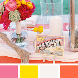 Carnation Pink, Lemon, White and Coral This pretty spring forward design encompasses all the sights and smells of a new blooming season. Carnation pink is the least expensive flower and color on the market real or artificial depending on the time of year for real flowers. The white base sets a charming stage for the parade of lemon, and coral arranged to not only represent sights of Spring but also spring activities as suggested on the place card in the picture. We are recommending this combination for spring as it would be perfect for any outdoor or indoor festivities such as sailing, beach or spring fever. 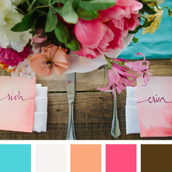 Teal, White, Peach, Fuchsia and Brown This laid back selection is ideal for the dog days of summer. The teal is the color of the water in the Caribbean. White dots subtly in minor roles as the power of the summer favorite of peaches and the daring and pretty fuchsia round out the cast being framed handsomely by the brown. This combination is recommended for Summer due to the relaxed nature of the design. Barns or other country settings would fit right at home in the pallet 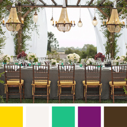 Canary Yellow, White, Jade, Royal Purple and Chocolate This fall festival groups together a pallet of dark and bright colors that brings in warmth and pops of surprise. The chocolate as the table base sets the tone for a cozy start. The small additions of Jade and Canary Yellow do a great job of brightening up the table giving depth to the design. The purple and white adds a touch of class and regal to the pallet in the flowers to complete the look made for a fireplace ball room on a cold January night. We recommend this look for winter as it invites you to come inside, get warm and enjoy. We would also recommend this combo for that iffy time between winter and spring when the weather is not yet warm but not as cold. 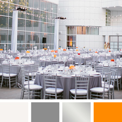 Off White, Slate Gray, Silver and Tangerine This minimalist look features a very uniform and tame atmosphere. Although the depths of the silver and slate gray create and beautiful contrast on the table base the off white sets the tone for a very traditional look. In the event your cake, dress or other related activity is over the top the vanilla background will be the perfect background for your fabulous piece to get the attention it deserves. The tangerine gives the table the tiny pop as a small oasis in the middle of a desert of gray scale. This look can also be completed using your favorite color such as red, pink or teal to replace the tangerine. 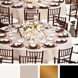 Off White, Sandstone, Copper, Black This formal look is ideal for black tie. The elegance of the copper and sandstone set a perfect stage for tuxedos and ball gowns. The Cinderella dress is on point. The sandstone and off white base is beautiful pattern that compliments the solid color amenities on the table of copper. This look is sometimes arranged with Gold instead of copper. We feel this takes away from the elegance and the look becomes more cosmic or 80's. This upscale look is perfect for the Golden 25th anniversary or the traditional princess wedding. This look is recommended for more of an evening affair due to the formal design. 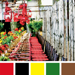 Scarlet Red, Black, Canary Yellow, Emerald, Sienna This colorful arrangement is ideal for theme events of the festive nature. Mexican fiesta, Caribbean getaway, African Royalty there are endless occasions this look and accommodate. The black table base gives a formal start. The pallet of red yellow and green cascade high and low for additional visual effects that incorporate a playful and inclusive look to the event that begs to be explored by your guests. The Christmas season is another theme for this color pallet as the green and red are the season's signature colors. The emergence of new color pallets for 2014 has inspired us greatly. We love the mixing and matching of colors and patters to give your event the look of your dreams.
0 Comments
Leave a Reply. |
Consuelo Bradley
Owner Elite Event Planning 1-334 954-9743 Food Safety Certified Alabama Licensed Planner [email protected] Archives
October 2020
Categories
All
|
 RSS Feed
